Color Psychology in Art
Color psychology in art is an important but often overlooked subject that artists should take time to learn.
But what exactly is it?
Color psychology in art explains how colors impact human behavior. For this reason, every color has different meanings, values, and psychological impacts on an individual’s mood. These factors influence the way a person engages with artwork.
By learning about color psychology, you’re able to effectively use color to express a specific atmosphere, evoke a feeling, or convey meaning.
For this reason, the colors you use in your artwork will have a large impact on the way the viewer interprets your works of art.
So, let’s have a look at color psychology basics to understand how colors impact art.
What Do Colors Symbolize in Art?
The psychology of color is powerful because it has a strong subconscious impact on the person who is viewing a work of art.
For example, you might create intuitive art that uses various shades of red to convey feelings of passion and anger. Someone who views your art is likely to interpret your feelings based on the colors you used.
As you can see, it’s important that you familiarize yourself with how colors impact mood.
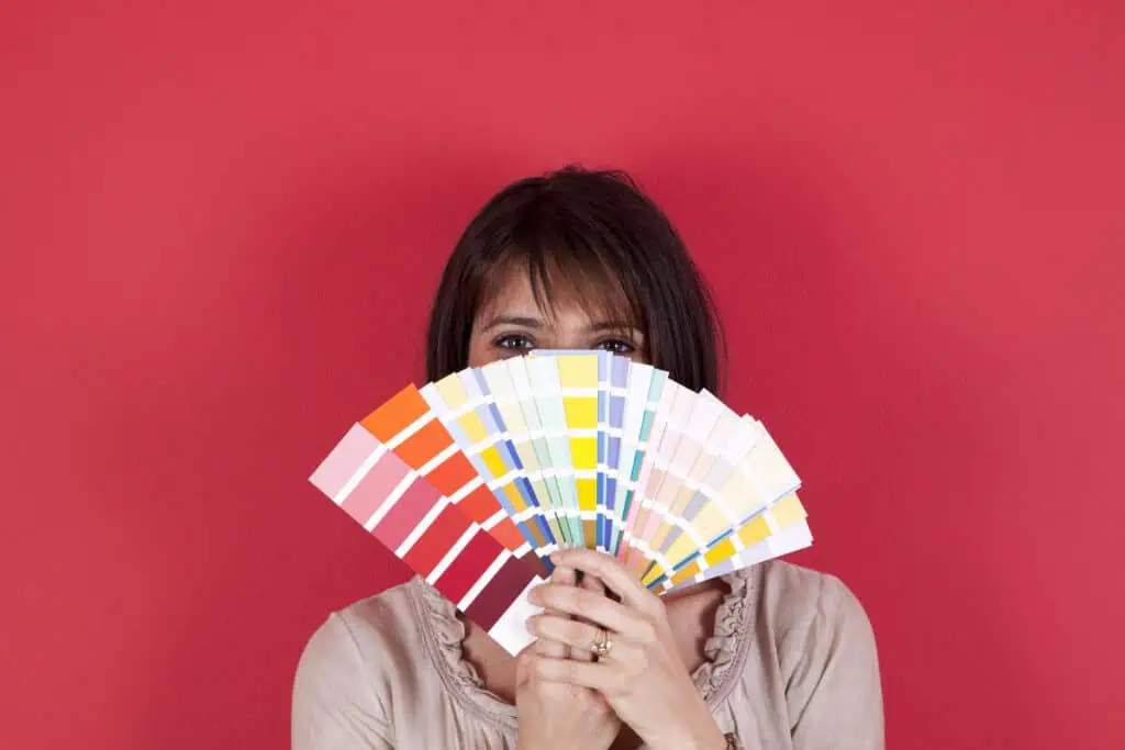
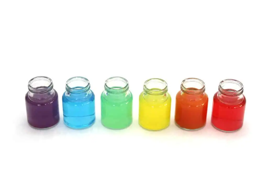
The warm colors include red, orange, and yellow. Some words that best describe this group of colors are warmth, strength, and anger.
But, individually, each of these colors represent different emotions, associations, and meanings.
For example, here is the breakdown of what warm colors symbolize:

On the other hand, the cool colors include blue, green, and purple. The best words that describe this group of colors include calm, coolness, and sadness.
Just like the warm colors, these individual colors all symbolize different things such as:

Last but not least, the neutral colors include white, gray, and black.
This group of colors is special because they harmonize with most colors.
Individually, each neutral color symbolizes the following:

Now that you understand the basics of color psychology in art, check out this helpful article about color theory in art.
How is Color Psychology Used in Art?
Color psychology is interpreted differently around the world because cultures have different associations with each color.
Therefore, take note that this article focuses on how colors are interpreted in Western cultures.
Artists who use color psychology in their artwork are intentionally using colors to elicit a mood, emotion, atmosphere, or meaning.
For example, an artist might use shades of blue in a monochrome watercolor painting to convey feelings of calmness.
Alternatively, an artist might use greens and browns in a drawing to illustrate some deeper meaning about nature.
Whatever you choose to do, it’s good practice to consider how you plan to use the psychology of color in your art.
Color Psychology in Painting: Next Steps
Now that you have a solid understanding of the basics of color psychology for artists, it’s time for you to create some colorful art.
Luckily for you, you’re ready to enroll in Monochrome Watercolor Painting: Master Value And Tone With One Color to learn how to use color psychology in monochrome art.
In this course taught by watercolorist Miranda Balogh, you learn how to create four different watercolor paintings that each use a different color.
Responses