Lettering Composition Tips: 5 Ways to Add Contrast
It happens to all of us at some point or another — you’re whipping up a bit of lettering, and no matter how hard you try, your lettering falls flat. What if I told you there was a super easy way to not only add visual drama but also make your piece easier to read? The solution is simple: add contrast! In this article, we’ll explore 5 ways you can add lettering contrast so you can take your lettering from ordinary to extraordinary!
What is Contrast?
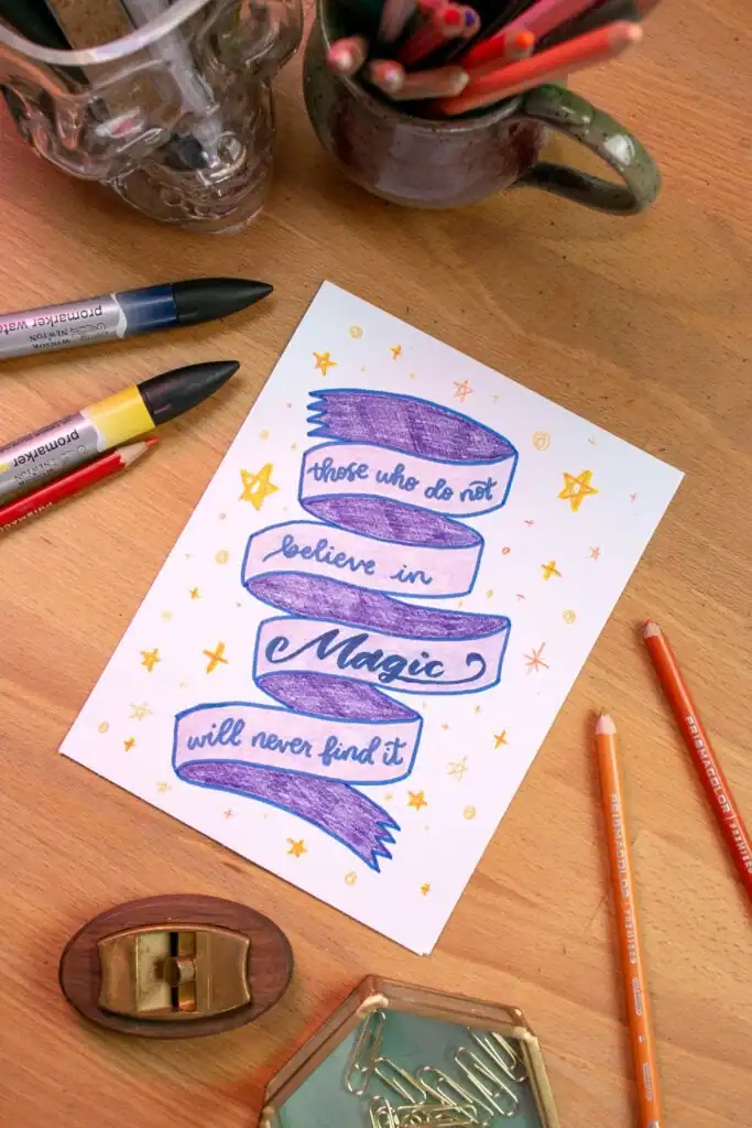
What is contrast in lettering, exactly? Contrast is a visual difference in your lettering composition that helps set one lettering element apart from another. When used correctly, contrast adds visual interest and clarity to your design. You can use contrast to emphasize the words that feel the most important in your piece so the reader can get a strong sense of what your lettering is about. Let’s take a look at some fun ways to add contrast to your lettering layout.
Size
The first way you can add contrast to your composition is by using size to your advantage. Think of the front page of a newspaper — what’s the first thing that snags your attention? Typically, it’s a large, bold header that is easy to read and invites you to read more.
To add contrast through size, pick which words are the most important in your phrase or quote. Then bump the size of those words so they’re larger than the supporting words, and bam! You’ve just successfully used size to create contrast in the lines of your lettering composition.

Color
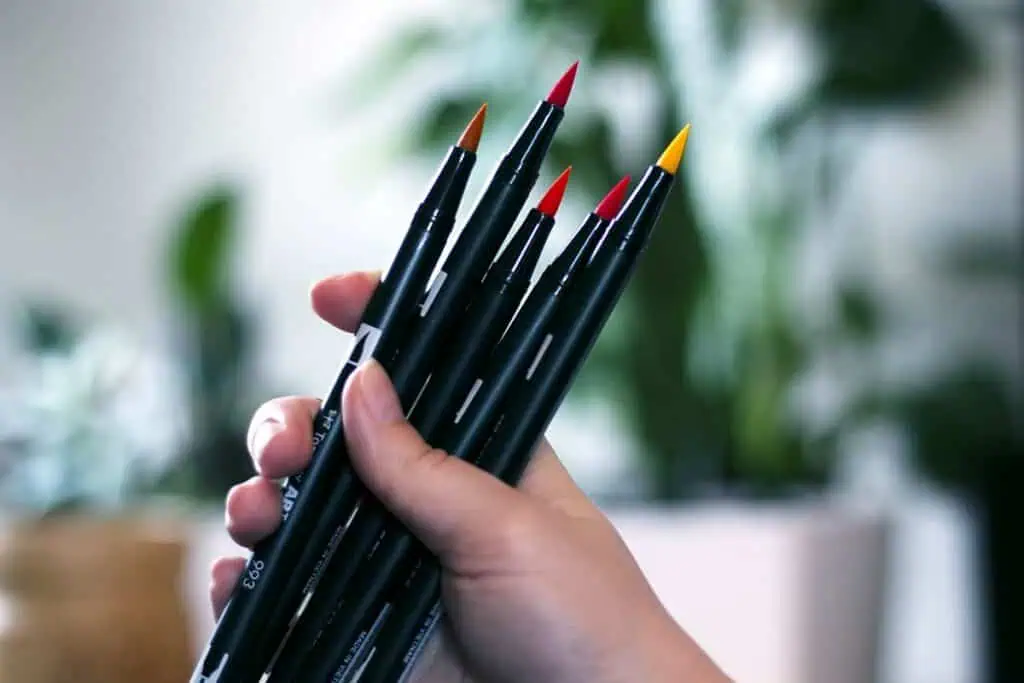
The next way you can inject a bit of contrast to your lettering piece is by hitting it with a light or strong blast of color. Try making the most exciting words an bold color that will jump off the page. Or if your piece is more on the subtle side, you can go with an accent color that’s slightly different than what you used for the main lettering. This is a technique you can use to great effect if you choose your colors carefully.
If you have limited colors in your lettering markers and pens, you might want to try using watercolor; you can get a huge variety of colors with even the most basic watercolor palette. You can learn the tricks to this technique in the Watercolor Lettering course.

Placement
Where you place your words can have a huge impact on your lettering layout, so it comes as no surprise that using placement to your advantage is another great way to add contrast.
You can place the emphasis of your piece in the center of your composition, for example. Or perhaps you can play around with how close or far apart words are from one another, which will create more or less emphasis on certain words and phrases as needed.
Be creative with your layouts and composition and see how many different ways you can write and arrange your words on the page to grab attention and make a point!

Style
When it comes to making a lasting impression, you can’t forget about style! Mixing up the lettering styles can add contrast and interest. Use a traditional serif style with a more modern sans serif, or put some playful script lettering at the center of attention.
There are a million amazing styles to choose from that can make a huge difference in the tone, mood, and clarity of your piece. We go into this topic deeper in the Fun Font Family Combos class, where you’ll learn how to use different styles to create your own unique look.

Weight
Last but not least, you can always play with the weight or thickness of your letterforms to create contrast or balance in your composition. Maybe you want to make one word stand out more than the rest? Just bump up the boldness (aka line weight) of that word for a bit of extra pizzazz! You can give visual importance to certain words by boosting their line weight in your lettering composition. Don’t be afraid to let your message take up space!

Choose to Stand Out
I think we can all agree that adding contrast can turn an ordinary lettering composition into a stunning one. By utilizing size, placement, style, weight, and color to your advantage, you can create clear and visually interesting lettering layouts that stand out from the crowd.
So go ahead — experiment with different elements of lettering contrast and see what works best for you! You may be surprised at how much a simple adjustment can punch up the intensity of your lettering layouts. When in doubt, add contrast!
If you’re eager to fire up your lettering skills to create gorgeous gifts or profitable products, then the Modern Lettering Academy is your perfect solution! This is the ultimate destination for aspiring letterers who want to elevate their craft. With 15 self-paced courses covering everything from foundational techniques to advanced layouts and exciting styles, enrolling in the Academy will ignite your creativity and supercharge your skills. Unlock your artistic potential and watch your lettering transform into stunning works of art!
Click here to check out what the Modern Lettering Academy can do for you!


Responses