The Ultimate Hand Lettering Guide for Beginners (2026)
What is Hand Lettering?
This is a segment from our Modern Lettering Academy. Enroll in the Academy now to dive into on a comprehensive journey through hand lettering, where you’ll master everything from the basic strokes to intricate compositions, all within a vibrant community of fellow lettering enthusiasts.
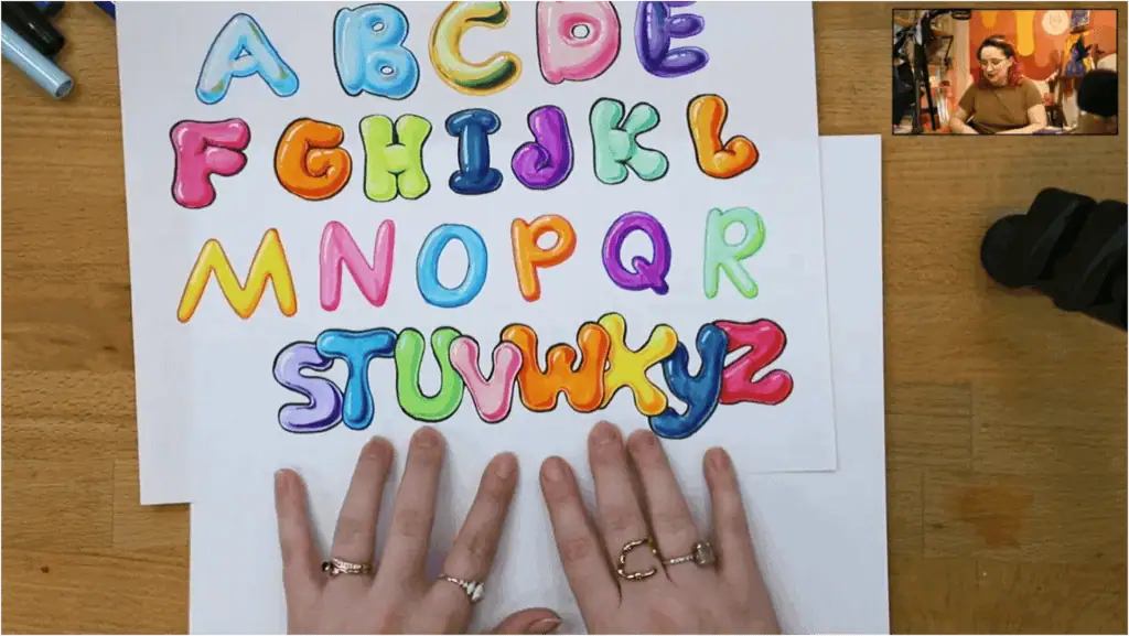
So you’re interested in the art of hand lettering, eh? That’s fantastic news. You’re about to enter into a whole new world of creative exploration and expressive fun. Perhaps you’ve tried your hand at hand lettering (pun intended) or perhaps you are brand new to the whole thing and you have no idea where to begin. Either way, this hand lettering guide will walk you through all the basic elements of lettering and give you a foothold in this incredible hobby.
First things first: what exactly is hand lettering?
Hand lettering is a specific creative skill that uses letters to create beautiful design and art. You might think that hand lettering is just a fancier version of handwriting, but that’s not quite right! Of course, both practices use the written language, but the similarities end there. Put simply, it is the art of drawing letters. Hand lettering requires some level of discipline and skill to be developed in order to achieve your lettering goals. That’s good news, though! That means that no matter how neat or messy your handwriting is, you can absolutely learn hand lettering and get good at it.
In order to succeed at hand lettering, you need to pick up a bit of knowledge about pens, materials, practicing techniques, and the letters themselves. Don’t worry though — I’ll walk you through all of this and more!
Want to get a bit more hands-on with your lettering practice? Check out my Hand Lettering Essentials Guide for Complete Beginners for a special price of only $7!

Materials Needed for Hand Lettering
The beauty of hand lettering is that you can pick up just about any pen or pencil and get started. But if you want to learn all the different aspects of lettering, then you need to pick up a few essential lettering tools.

Hand Lettering Essentials
There are a ton of different hand lettering materials that you can go out and get, but here are the ones I suggest to total newbies who just want to learn the basics.
Paper
You need a good base for all your lettering, right? You can obviously use regular computer paper or plain cardstock. Those will work just fine! But for learning purposes, I would highly recommend a Rhodia Dot Pad. The dot grid makes it a million times easier to watch proportions, angles, and letter sizes as you learn.

- A4 in size
- Paper within the notepad is made from Clairefontaine 80 g Superfine Vellum
- 80 detachable micro perforated sheets
- Printed with a light grey grid with 5 mm intervals between dots
- Suitable for use by creative people, architects, graphic designers and more
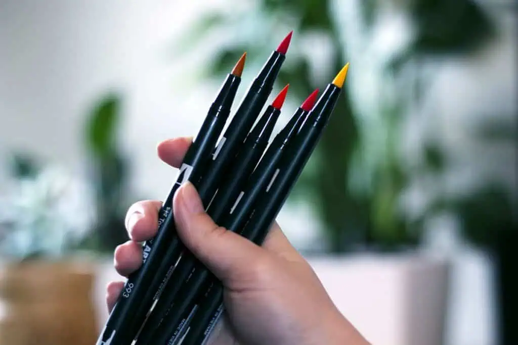
Pens
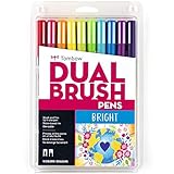
Tombow Dual Brush Pens
I’m a huge fan of Tombow as a brand. I started my lettering journey using their products and I still use them as a professional letterer. I love Tombow so much, in fact, that I even became a Tombow Brand Ambassador! The very first pens I bought from Tombow was a set of their Dual Brush Pens. These pens are excellent because the brush tip allows a great deal of flexibility and the bullet tip is perfect for simple linework. Plus they come in a whole variety of color sets, like bright, pastel, galaxy, secondary, and grayscale. These pens are a hand lettering must-have, so pick your favorite palette and grab them!
Tombow Fudenosuke Brush Pens
While the Dual Brush Pens cover the color category beautifully, you will also want something in black and something a bit smaller. That’s where the Tombow Fudenosuke Brush Pens come in. They come in both a soft and hard tip, giving you tons of flexibility for your hand lettering projects. I use these pens constantly and I’m always buying more because they are essential in my hand lettering artist toolkit.
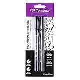
- Contains both the soft and hard tip Fudenosuke Brush Pens
- Features a flexible brush tip for different lettering and drawing techniques
- Create extra fine, fine or medium strokes by a change in brush pressure
- Great for calligraphy and art drawings
- Soft tip and hard tip water based, pigmented black ink
Faber-Castell Pitt Artist Pens
One thing you definitely need for hand lettering is a variety of black pens. That’s why I highly recommend this Faber-Castell pen assortment. They have plenty of black pens in various widths, along with a few interesting nibs for you to play with and explore.
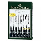
- PITT artist pens contain pigmented India ink that is both archival and acid free
- Perfect for drawing on the go!
- Convenient wallet keeps all your drawing tools together
- Pigmented India ink that is both acid free and pH Neutral
- Smudge proof and waterproof when dry
Extra Hand Lettering Supplies
If you decide that you want to explore beyond the bare basics of hand lettering supplies, beyond basic equipment like an eraser, protractors, and rulers, you’ll be delighted to find a whole world of fun materials waiting for you. Let me share some of my favorites!
Paper
Pens
- Uniball Signo White Gel Pen
- Zebra Mildliners
- Staedtler Triplus Fineliners
- Papermate Flair Candy Pop Felt Tip Pens
- Artline Stix Brush Pens
- Crayola Markers
Pencils
Miscellaneous
The Anatomy of Letters
One of the very first things you need to learn before you jump right into lettering is the anatomy of letters. It’s easy to want to skip this step because you might think you already know plenty about letters. After all, you read and write every day! But I promise you that a solid foundation in letter anatomy will go a long way towards your lettering goals. Understanding letter anatomy can help you figure out how to best make a hand lettered work of art look balanced and aesthetically pleasing.
There are plenty of ways to break down the anatomy of a letter, but let’s just stick with the basics. There are four lines that you need to keep in mind as you write out your letters: the base line, the X height, the ascender line, and the descender line.
The Base Line
This is the line where all your letters will sit. The main body of each letter’s bottom will rest upon this line, and from there you will base the other aspects of letter anatomy. Think of it as your own bottom when you sit on a chair.

The X Height
The X-height is the line where the tops of the lowercase letters reach. To be perfectly exact, the X height is the height of a lowercase “x” in a given typeface. It also goes for all of the simple lowercase letters, such as “a”, “e”, “o”, “n”, and so on. These lowercase letters should all sit on the base line and reach up to the X height. Since we’re comparing these lines to the human body, imagine the X height line is right at the tippity top of your head.
The Ascender Line
All the letters that have strokes that reach upwards will make use of the ascender line. That includes letters like “k”, “h”, and “t”. These letters have strokes that are taller than the X height, so they reach to the ascender line. Imagine that you’re holding your hands above your head — the tips of your fingers would touch the ascender line.
The Descender Line
You probably know where this one is going. Where the ascender line reaches up, the descender line hangs down. This is the line where dangling letters like “g”, “q”, and “y” can rest their tails. If you’re sitting in a chair with your hands reaching up, then your legs sitting on the floor would reach the descender line.
How to Use Anatomy in Hand Lettering
Why do you need to know this? One of the most important elements in basic hand lettering is consistency. When you maintain a tight framework for your lettering style, it can look incredible. One of the marks of an inexperienced letterer is inconsistency in their lettering styles — it can be inconsistent shapes, line widths, spacing, or letter sizes. Understanding letter anatomy helps you make your lettering more consistent and therefore look more advanced. Of course, it takes practice to really get used to creating consistent letters, but the quicker you implement your knowledge of anatomy, the faster you will develop.
You can also take this knowledge and adjust any of the guide lines to achieve different lettering styles. Move the ascender line higher, shrink the X height, and lengthen the descender line to create a tall, elegant style. If you want something a little more youthful and poppy, then balloon out the X height and make the ascenders and descenders smaller. Play with these straight lines and see what new styles you can create!


Lettering Families
Another important element to hand lettering is learning about lettering families, or font families as you might know them. There are a million fonts out there, but the majority fall into one of three main categories. You can choose to focus your efforts on mastering just one family, but figuring out how to create lettering with a variety of font families can really make your work pop. The three families that you need to learn are serif, sans serif, and script. You may or may not have heard those names before, but I promise you are familiar with them already. You see dozens of examples of these hand lettering styles every day when you see advertisements, watch TV, or read your favorite blog. Let’s break down each family.
Serif Fonts
The serif family is the most traditional branch of the lettering family, though that doesn’t mean it is boring! This font family is very common with printed text, because the small lines that are added to the letters, otherwise known as “serifs”, help guide the eye and aid in reading. These little extra lines at the ends of strokes are incredibly subtle if you aren’t paying attention, but there are certainly several serif fonts around you right now. In fact, the title in the title graphic at the top of this post is a serif font! The popular fonts Times New Roman, Garamond, and Georgia are all serif. When it comes to lettering, the serif family might be one of the most difficult for a beginner to learn quickly due to all of the extra lines and strokes.

Sans Serif Fonts
As you might have guessed from the name, sans serif fonts lack the serifs that are characteristic of the serif family. That makes the sans serif family often appear much more sleek and modern. In fact, sans serifs fonts grew to popularity alongside the rise of computers. In the early days of computers, the screen was so pixelated that serif fonts were difficult to read with all their extra lines, so sans serif fonts became the obvious pick. The font of this paragraph is actually sans serif! Some other common sans serif fonts include Ariel, Helvetica, and Verdana. If you want to learn how to hand letter serif fonts, starting with the sans serif family is a great way to go since they tend to be more simple and clean.

Script Fonts
The script family is one of my absolute favorite families, and it is a love shared by many in the hand lettering community! In fact, most letterers begin with brush lettering, which deals largely with the script family. Script is usually cursive, with the letters connecting to one another. There is typically a variation in line thickness, giving it an appealing flow. You might notice that I work almost exclusively in script, and for good reason! Script is often forgiving of mistakes and doesn’t show errors as blatantly as serif or sans serif fonts might. If you are just beginning, I would highly recommend you brush up on your cursive and jump in with the script family.

How to Hold Your Body for Lettering
When you’re lettering, it can be tempting to sit in some less than ideal positions. You might want to slouch, put your feet up, or lean your elbows on the table. However, these kinds of postures can not only negatively affect your lettering results, but it can leave you feeling sore and achy. With just a little bit of body awareness and practice, you can train yourself to position your body for the best lettering.
How to Sit for Lettering
First, let’s talk about the best way to sit when you letter. When you go in for a hand lettering session, you should sit down in a comfortable chair with your feet flat on the floor. Sit close to the table, but try to keep your back straight and don’t lean over your work. That’s pretty much it — sit on a chair with good posture. Sounds easy, right?
Unfortunately, it’s really hard (at least for me) to avoid slouching or hunching over the paper while I’m lettering. My instincts tell me that my face needs to be as close to the paper as possible. This is terrible, and you will most certainly feel the pain if you don’t sit straight.

Practice sitting properly from the beginning of your lettering journey and develop those good habits early. You want to take care of your body so you can keep doing this for a long time! Plus the more relaxed and loose your joints are, the more fluid and lovely your hand lettering can be.

How to Hold Your Pen for Lettering
While your posture is important for lettering, the position of your arm and hand can make or break your lettering. In fact, when people tell me that they just can’t get the flow, pressure, or consistency of lettering figured out, the problem usually lies in arm position. So how should you hold your pen for optimal lettering?
The key is moving the pen with your shoulder and not your fingers. It sounds totally ridiculous, but I’m serious! When you write or lettering, you are most likely going to move the pen with your fingers and hand, moving from the wrist. This is the wrong way to move the pen! Lettering with your hand and fingers will restrict your motion, leading to stiff lettering with no flow or grace.
Instead, you need to move your whole arm. Your elbow should either not be touching the table or should be lightly touching so it may glide around uninterrupted. When you’re done lettering, your shoulder muscles should be burning a bit. Your wrist and fingers can still move a bit once you get used to the proper way to move your arm, but in the beginning, you should attempt to make them as still as possible.
How to Develop Muscle Memory for Lettering
One of the recommendations for developing the right shoulder and arm movement for lettering is to write on the wall. Having access to a chalkboard or a dry erase board makes this exercise easiest, though you can also tape a piece of paper to the wall and write on that. Most people have no trouble using their whole arm when asked to write on a dry erase board, so it’s a great way to practice and get a feel for the right muscles. Once you identify those muscles, you can focus on them while you lettering and develop the right muscle memory for lettering.
Line Weight in Lettering
Of all the skills you need to learn to master hand lettering, line weight is priority number one. But what is line weight, exactly? It’s simple! Line weight refers to the thickness or thinness of a line. If the line is thick, the weight is heavier. If the line is thin, the weight is lighter. The best way to remember this is to think of the pressure you used to draw the line. If you applied heavier pressure, the line weight is heavy, and vise versa.
The reason line weight is vital to hand lettering is because literally every single font style or lettering style relies on line weight in some way, even if the font has the same weight through and through. The look of your lettering can drastically change if you simply alter the weight of the lines. And when you’re creating lettering with a font that varies line weight stroke to stroke, you need to get that weight consistent to make it look great. If your line weights are inconsistent from letter to letter, it’s not going to look its best. Of course, as with anything else in hand lettering, nailing line weight takes practice. Developing the right muscle memory as discussed in the last section will go a long way in helping you master this skill.
Downstrokes and Upstrokes
Throughout this guide, you will see the words “downstroke” and “upstroke”, which refer to how you are pulling your pen when you make the line. There is a general rule in the hand lettering world that downstrokes, or the stroke of your pen when you pull it toward the bottom of the page, have a heavy line weight. Upstrokes, which is the stroke of your pen that is pushing toward the top of the page, are typically a lighter line weight. This rule can be broken or bent to suit your lettering needs, of course, but it’s best to accept it as gospel while you’re learning hand lettering. The only time you will regularly see this rule broken is with sans serif fonts, which typically have a single thickness for all the strokes.
How to Practice Hand Lettering
As you may have guessed, like any other art form, practice is absolutely necessary in order to excel in hand lettering. You can’t pick up a brush pen for the first time and be amazing. Everyone has to start somewhere, but regular practice can help accelerate your growth and set you apart. So how do you practice?
Hand Lettering Drills
The best way to launch into practicing your hand lettering is to engage in drills. Hand lettering practice drills are simply repetitive lines or shapes to help you practice the movement of lettering. Drills can help you work on thick downstrokes or thin upstrokes. They can aid you as you learn how to transition between basic strokes or curve the line for certain letters. Besides being great stand-alone practice, drills are excellent for warming up before a lettering session! I like to do a page of drills before I sit down and start lettering anything serious.

If you want to grab free practice sheets to help you get started, you can subscribe to my email list and download one right now! There are other lettering worksheets, printables, and additional resources, too! Just click here to sign up and you can start some hand lettering drills ASAP!
Practice in Other Ways
Besides drills, what other ways can you practice? Well, there are lots of ways to practice hand lettering! Here are some excellent ways to get consistent practice in.
#1 – While Watching TV
Grab your favorite brush pen and some paper, sit down for your favorite TV show, and letter away! I like to letter character names and quotes from the show. It doesn’t have to make sense or be presentable for social media. Just fill a page up with random words, names, and phrases. It’s a great way to make time for lettering without having to change your schedule at all.
#2 – Bullet Journal Headers
Keep a bullet journal? Utilize your lettering skills and letter out your daily, weekly, or monthly headers! This is one of the ways that I practiced the most and learned a ton. One of the perks of practicing this way is that you get to practice every day in an organic, simple way.
#3 – Take Notes
I first started learning hand lettering when I was working as a receptionist. One way I practiced with my new lettering skills was to take down notes during meetings or phone calls with some lettering flair. Of course, I couldn’t do it constantly because I often needed to write quickly, but I could do a little bit here and there. If you’re a student, take notes during class with lettering. If you work full time, letter your Post It note reminders or meeting notes. Find some way to incorporate lettering into your existing writing routines and you’ll find yourself practicing all the time!
#4 – Join a Challenge
You can find all kinds of lettering challenges on social media that are perfect for beginners. You can join in regardless of your skill level, meet other lettering enthusiasts, and get inspired by the prompts and your fellow letterers. Instagram is a great place to find lettering challenges and share your work. Check out the #happyletteringchallenge for a fantastic starting point!
What is Brush Lettering?
This post covers all the basics of hand lettering, but I’d be remiss if I didn’t point out the differences between hand lettering and brush lettering. Brush lettering is a common subject that is brought up all the time online, and it’s important to understand what sets it apart from hand lettering. Thankfully, the difference is quite simple!
Hand lettering is the broad net that covers everything in the art of creating letters beautifully. Brush lettering is a practice that falls under that net, making it a subcategory of hand lettering. Brush lettering is basically just a general term to describe any hand lettering style that is done with a brush pen. It can also be used to describe the specific style of lettering in a script font with a brush pen. Hand lettering, on the other hand, can utilize any pen or marker.
So any time you see the terms hand lettering or brush lettering being thrown around, you can understand exactly what areas of the lettering world are being discussed. The differences are subtle but important!
What is a Brush Pen?
Since the definition of brush lettering hinges largely upon the tool being used, I think it would be a great idea to point out what makes a brush pen stand out from normal pens. So what is a brush pen, anyway?
First, let’s talk about normal pens that we use in regular writing every day. You probably use ballpoint pens, felt tip pens, and gel pens often enough to know how they write. If you step up to basic drawing pens, they are similar to felt tip pens in how their nibs are designed. They can come in a variety of sizes, but these pens write with a single line width that can only be thickened by putting down more strokes.

A brush pen, on the other hand, has a flexible nib that can create thick or thin lines depending on the pressure used while putting down a stroke. Brush pens can either have a flexible cone-shaped nylon tip or have actual individual bristles that behave exactly like a paintbrush. Brush pens feel totally different from normal pens and can produce totally different results, making them a fun tool to add to a letterer’s toolkit.
Some Brush Lettering Tricks
If you want to test out brush lettering without investing in a set of brush pens, you can buy some cheap Crayola markers and create a similar effect. It’s an economical way to tip your toes in the water before you spend a lot of money! Another super easy technique you can use is called faux calligraphy. This technique allows you to use just about any pen to achieve a brush lettered look without actually using a brush pen! I would suggest you eventually grab some brush pens and give them a try, but it’s always good to have a few tricks up your sleeve.
Adding Embellishments
At this point, we have covered all the basics of hand lettering. Hurray! Most of hand lettering is understanding fonts, line weight, and developing the right muscle memory. But that doesn’t mean that there isn’t more to learn! There are a ton of fun ways to inject style, decoration, and intrigue into your lettering with some embellishment techniques. Let me share some of my favorite ways to take your lettering to the next level.
How to do Bounce Lettering
Bounce lettering is exactly what it sounds like — the letters bounce! The letters don’t all sit on one base line like we learned in letter anatomy. Instead, the base of each letter varies, creating a fun, bouncy effect. This is one of those instances where you learn about letter anatomy so you can break the rules!
When you first try your hand at bounce lettering, I would suggest you use a pencil. Getting the right balance between higher letters and lower letters takes some practice. Eventually, though, you will develop an eye for it. Sometimes you just need to do it for yourself to see what looks best. Remember, you want some level of consistency with the X height, ascenders, and descenders, even if they aren’t all on the same base line. Keep the letters all roughly the same size when you do bounce lettering for the best effect.
Begin your bounce lettering by drawing out the first letter. Then determine where the second letter’s base line should sit — should it be high or low? Keep the letters on slightly different baselines or make the difference dramatic. If the letter has an ascender, it might be great to have that letter’s baseline sit low. If there is a descender, perhaps position the letter high so the descender can swoop and curl beneath the word. Play with it and see what looks best! You might be tempted to have each letter in a word vary evenly between high and low, high and low. This rhythm doesn’t always produce the best results. Instead, try to keep it somewhat random with high and low letters. I promise that if you practice your bounce lettering you will get a feel for it!


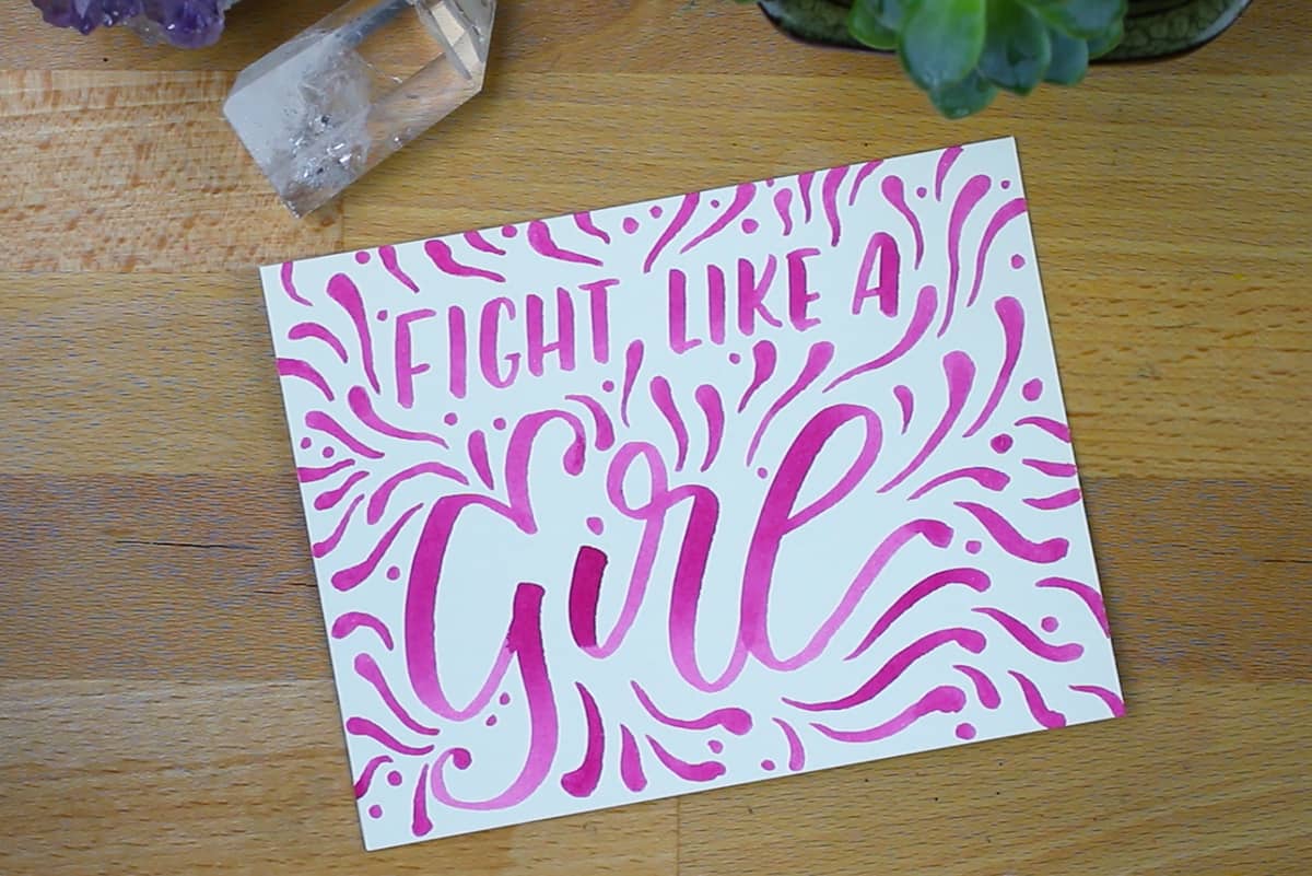
Flourish Fancy
Another way you can add style and grace to your lettering is with the use of flourishes. Flourishes are any decorative swoops that dance around and between your letters. Often, flourishes are attached to ascenders, descenders, or just about any part of a letter if you’re creative enough. They can be wild and dramatic or simple and understated. Either way, they can take your lettering to the next level. So how do you start creating flourishes?
Firstly, I would suggest you start practicing your flourishes with a pencil. They can be a bit tricky at first, and the ability to erase and redraw a line is incredibly helpful. I would most certainly advise against using a pressure sensitive marker like a brush pen while you’re starting out. You don’t want to worry about line weight when you’re first flourishing.
There are a ton of different flourish shapes you can create for seriously stunning effects. Simple wiggles like the picture below, especially when repeated, can look awesome. Dangling letters like Y and J can create excellent opportunities to flourish away. If you want to learn some basic flourish shapes, grab my free flourishes worksheet right here to help you get started!
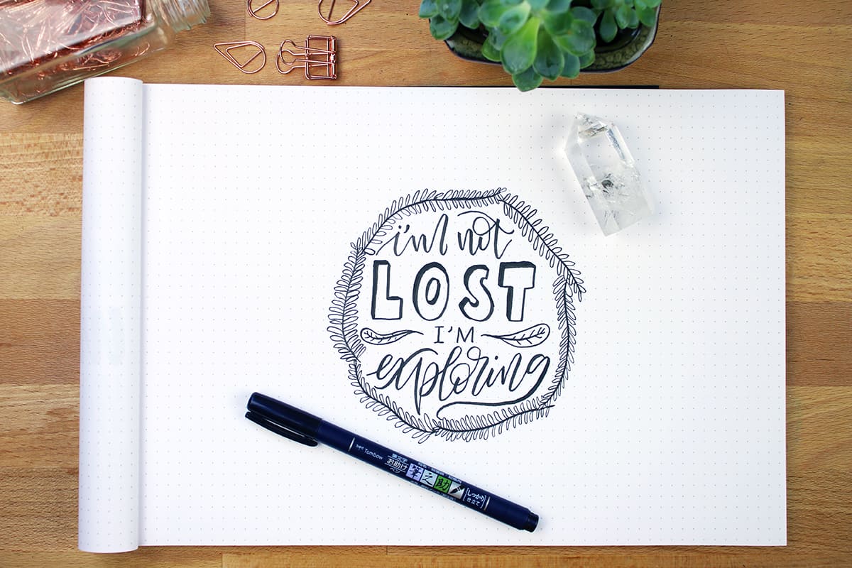
Borders, Doodles, and Textures
Beyond bounce lettering and flourishes, you can add nearly anything to your lettering to add more character! Draw borders around a phrase, banners around specific words, and branches along the edges. Create backgrounds, textures, wreathes, shapes… the list goes on! As long as you are bold enough to create it, anything is possible in the realm of hand lettering. After all, this is a form of art. Make it yours!
Pointed Pen Calligraphy
There is one category of hand lettering that has fascinated people for centuries — nib calligraphy, otherwise known as pointed pen calligraphy. Nib calligraphy is elegant, dignified, and as old world as it gets. But that doesn’t mean you can’t add it to your repertoire of hand lettering knowledge in the modern world! Here are the basics that you need to know to get started with a nib and ink.
You’ll be happy to know that all the general principles of hand lettering remain the same for nib calligraphy. Letter anatomy, line weight, and font families — the rules all apply. Nib calligraphy is a style that is almost entirely centered around some type of script lettering, though you can absolutely venture into the other font families. And just like brush lettering, the general theme of heavy downstrokes and light upstrokes is consistent in nib calligraphy. Basically, everything you’ve learned so far applies to this new tool.

Nib Calligraphy Supplies
You don’t need a ton of supplies to get started with nib calligraphy. After you grab a nib, nib holder, and ink, you should be good to go! Here are some of my favorite pointed pen calligraphy materials.
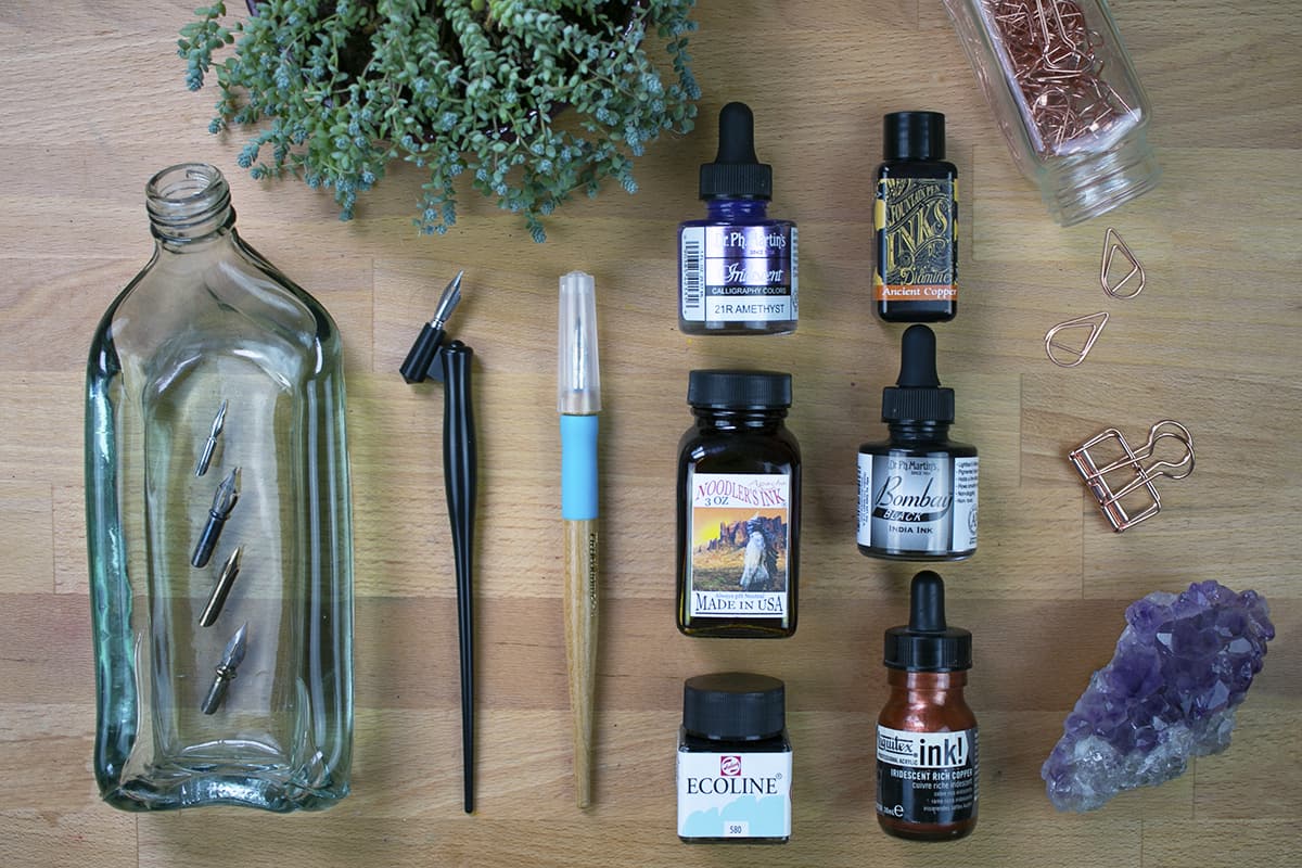
Nibs
The most important part of nib calligraphy is, of course, the nib! Specifically, you need a flex nib. This means that the two sides of the tip (also known as tines) are bendy and can spread under some pressure. A stiff, unforgiving nib will not be useful for calligraphy. I would recommend one of these to get started.
Nib Holders
There are two basic types of nib holders: standard and oblique. The standard is pretty much exactly like a normal pen or pencil, with the nib being right on the end of the nib holder. An oblique pen holder is different in that it puts the nib at an angle, which allows you to better see your work and create thick and thin strokes easier. I can’t say I would recommend one or the other for a beginner, as it all boils down to personal preference. If you can, try both types of nib holders to see which works best for you! I use both regularly.
Inks
One of the perks of nib calligraphy is that you can use a wide variety of dipping mediums — that is, you can use ink, watercolors, certain types of paints, and more! As long as you can get a decent viscosity for the writing and you can clean it off of your nib, you can probably use it for nib calligraphy. Here are my favorite inks and paints for pointed pen calligraphy!
- Noodler’s Apache Sunset Ink
- Diamine Ancient Copper Ink
- Dr. Ph. Martin’s Bombay Ink – Black
- Dr. Ph. Martin’s Iridescent Calligraphy Ink – Amythest
- Liquitex Acrylic Ink! – Copper
- Ecoline Liquid Watercolors
- Dr. Ph. Martin’s Hydrus Liquid Watercolors
- Finetec Metallic Watercolors – Gold Set
Paper
Preparing Nibs for Use
When you get a brand new nib, you might want to pop it into a nib holder and immediately get started. However, there is one step that you need to do before your nib ever touches paper. All nibs come with a thin layer of oil that the manufacturer puts on them to prevent rust. That oil might not seem like a big deal, but it will seriously affect how the nib reacts with ink. Unless you remove the oil before use, you will have the most frustrating time trying to write!
Thankfully, removing the oil is a quick and painless process. There are a few ways to do it, all of which can be done with basic household supplies. You can simply wash your new nibs with dish soap and a small brush (like a toothbrush). You can wipe the nibs with something acidic, like vinegar. If you have several nibs to clean off at once, you can even stab them into a regular ol potato for fifteen minutes. When you’re done, just pull them out, rinse them off, and dry them. Easy peasy!
Learn More
Want to improve your nib calligraphy? The easiest way is to practice, of course! Do drills, just like the ones you would do for brush lettering. It’s a great idea to do a sheet of drills before any lettering session to loosen you up and prepare your arm.
And if you want to find more awesome resources on nib calligraphy, here are my favorite ways to learn!
Watercolor Hand Lettering
I must admit — one of my absolute favorite ways to hand letter is with watercolors. Watercolor hand lettering is flexible, dynamic, and unique each and every time! There’s something so freeing about watercolors as a medium. No matter how hard you try, you can never get the same result twice, and you can never fully control it. But once you learn to embrace the wild nature of watercolors, you can use it to create some truly stunning works of hand lettering. There are a ton of advanced ways to use watercolors for lettering (like using masking fluid), but for now, I’ll focus on a few of the basic techniques. Interested in learning more? Head to this post for a more in depth tutorial!

Watercolor Lettering Supplies
There are a few things that are essential to using watercolors. And guess what? You don’t need to invest in a ton of super expensive materials to begin hand lettering with watercolors! There are plenty of very economical options that you can pick up to help you get started.
Paper
Believe it or not, the most important thing you need to buy for your watercolor hand lettering kit isn’t the paint — it’s the paper! Using cheap or inappropriate paper will make you seriously hate watercolors. Trust me, I’ve been there. Cheap paper will wrinkle, bleed, warp, and make your paint look terrible no matter how hard you try. Spend your money on decent watercolor paper and you won’t look back!
Watercolor Paints
You can use just about any watercolors for hand lettering, but there are a few brands that really excel. I’ll list a super cheap watercolor palette that’s great for beginners. However, if you really want to jump into watercolor lettering with both feet, I would suggest you try some bottles of liquid watercolors. Liquid watercolors are second to none when it comes to lettering. I would also suggest you grab a palette of Finetec metallic watercolors because they are simply gorgeous. You’ll never want to stop practicing!
- Prang Watercolor Palette
- Dr. Ph. Martin’s Hydrus Watercolors
- Ecoline Liquid Watercolors
- Ecoline Liquid Watercolor Markers
- Finetec Metallic Watercolors
- Sennelier Watercolors
Paintbrushes
When it comes to hand lettering with watercolors, there is only one set of brushes I’d recommend. These have been my favorites for years.
Blending in Watercolor Lettering
The most obvious and direct way to use watercolors for hand lettering is to use a single color for all your lettering. But you don’t need me to tell you how to do that! After all, all the lettering techniques are the same as standard brush lettering. So I’m going to jump to the next step and show you how to blend several colors together while lettering.
This tutorial goes into more detail (and has a video!), but let me share the basic principles. With watercolor, you need to move quickly because the paint usually dries pretty fast. If you want two colors to blend, you need to do it while the paint is wet so you get a soft, smooth blend like the picture below. The trick to mixing two or more colors from letter to letter is to quickly wipe your brush on a paper towel between colors. Doing this ensures that you don’t accidentally end up with purple if you’re trying to blend blue and red. It’s a tiny step that seems obvious, but it took me lots of frustrated attempts to figure it out! Of course, if you want the colors to mix together and create a whole new color, all you need to do is not clean your brush and you will achieve your desired effect.
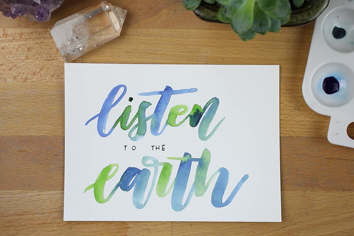
I know it seems simple enough to do when you read it, but practice is where you’ll really figure this out. Like I said before, watercolors are a bit wild and unpredictable. You’ll need to get a feel for how much water to add to your brush, how quickly you want to letter, and how often to clean your brush while you letter. I imagine you’ll probably be frustrated or annoyed the first few times you try watercolor brush lettering because it’s so hard to control. But I promise that if you stick with it, you will be rewarded for your patience and practice!
Watercolor Lettering Pro Tip
If you’re just practicing and not giving the final piece to anyone, letter on both sides of the paper to make the most of your resources! Wait for one side to dry before you flip it, though, unless you want watercolors all over your desk.

Create Watercolor Backgrounds
Another great way to use watercolors is by creating lovely watercolor backgrounds! Watercolors can create such a wide variety of color mixes, textures, and patterns, so the possibilities are endless. Experiment a bit with your paints and see what you can create. Create a simple, flat wash of color like the picture below. Or blend a few colors softly into the background. Try creating a gradient of light to dark and see how you like it as a backsplash!

You can also use regular table salt on semi-wet watercolor to create a million tiny starbursts. Just wait for it to dry completely and wipe off the salt before you letter and that’s it! Use your clean wet brush to dot the semi-wet paint and you’ll end up with softer spots of lighter color, like the picture below. Try using rubbing alcohol on wet paint for a cloud-like pattern. Basically, experiment and see what fun stuff you can come up with — then letter on top of it!

The Ultimate Hand Lettering Guide
This guide may be long, but it in no way encompasses all of hand lettering styles. There is always something new to discover, something new to master. No matter where you are in your hand lettering journey, you are forever a student. So don’t worry about comparing your work to anyone else’s lettering — it is okay to make mistakes! you are growing and developing, and you are doing amazing stuff.
I hope this ultimate hand lettering guide was helpful and you are feeling charged for some lettering action. Drop a comment below if there is anything I missed in this guide, or just let me know your biggest obstacle in hand lettering!

Responses